16 Sep 2018
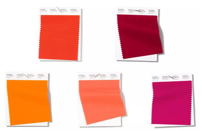
Red and orange are the main colors
Pantone, the world's leading color forecaster, has released its spring/summer 2019 New York fashion week fashion color trend report.
The mindset for Spring/Summer 2019 reflects our desire to face the future with empowering colors that provide confidence and spirit; colors that are uplifting; joyful hues that lend themselves to playful expressionism and take us down a path of creative and unexpected combinations. The five most popular colors will be Fiesta, Jester Red, Turmeric, Living Coral and Pink Peacock.
Mr Eisman, executive director of Pantone, said:
From a psychological point of view, the fashion colors presented here represent confidence, excitement and happiness, and help to better combine high fashion with street style.
This season’s report features the top 12 stand out colors
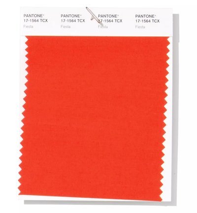
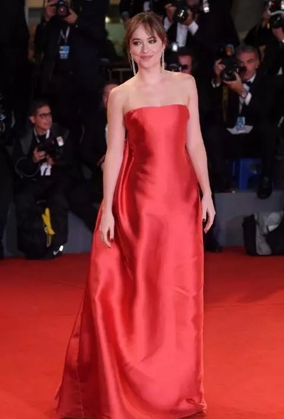
PANTONE 17-1564
Fiesta
A festive orange red, Fiesta radiates energy, passion and excitement.
Eiseman said:
Just seeing the color conveys excitement, pure energy and passion, which conveys a sexy feeling, but its inner warmth makes it a very approachable red. If you look at the color, it's a little bit black, so it's potentially powerful, and that's inherent to the red family." Daktota Johnson wore it to steal the show at the Venice film festival
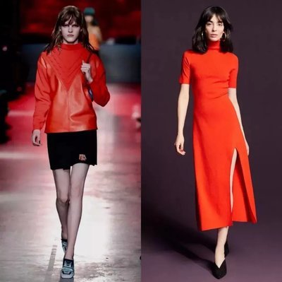
左:PradaPre-Summer2019,右:A.L.CPre-Summer2019
PANTONE 19-1862
Jester Red
Adding depth and intensity, Jester Red combines rich elegance with urbanity.
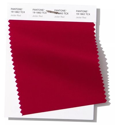
It may be an unexpected choice for spring, but according to Eiseman, the concept of just pulling colors from colors that seem to belong in another season and applying them to unexpected directions has become a trend.
Eisman said:
'this wine is no ordinary spring color, it is deeper and stronger, and has an elegant quality that goes well with' big city red '.
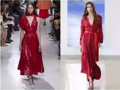
左:CALVINKLEINSpring2018,右:HellessySpring2018
PANTONE 15-1264
Turmeric
Turmeric is an enlivening orange that infuses a hint of pungency into the palette.
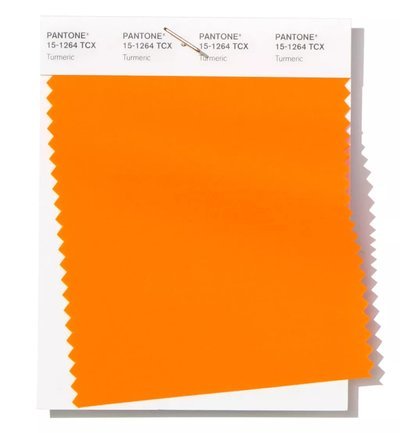
Eiseman: as a colorist and forecaster, we follow the food industry closely because it provides so much information about what people will be interested in, what they will read, and what they will be interested in. 'when you use the word' seductive, 'it can seduce your tongue or your eyes.'
In fashion, this is clearly an important issue. Beauty brands are already working with turmeric masks and other products.
PANTONE 16-1546
Living Coral
Living Coral is an affable and animating shade whose golden undertone gives it a softer edge.
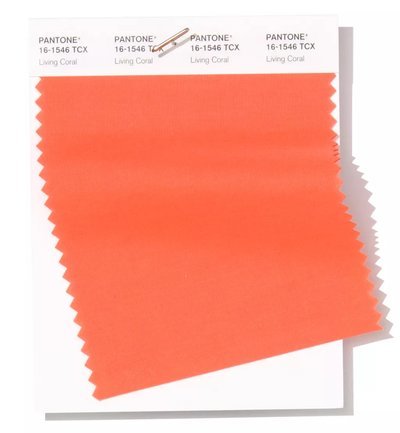
This lovely color has the right edges, and living coral still draws attention, but not as pronounced as orange. Prada is a fan of the hue, as is zac posen. Living coral and other orange family tones will continue to be at the forefront of the spring trend, set against a multitude of skin tones.
PANTONE 18-2045
Pink Peacock
The tantalizingly theatrical Pink Peacock fans out to a feast for the eyes.
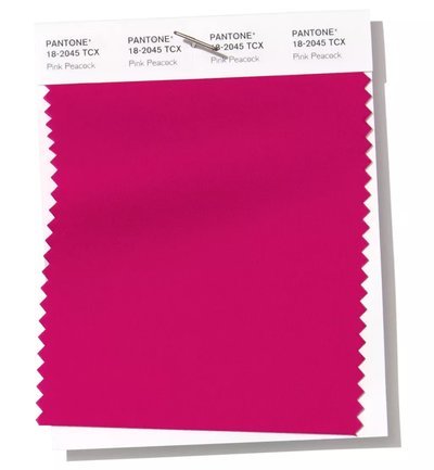
Gender aside, pink is the color of spring. The hue and equally intense pink has become increasingly popular in recent seasons of men's and women's clothing collections, Eiseman said.
Valerie Steele of the institute of fashion technology, director and museum director: 'people are widows dressed like sicilians in black, and I just stumbled across that over the past few years, more and more people have been wearing pink, including men, not just 6-year-old, but mature people. Eisman would agree. It's hard not to include it, and designers understand that. Not only is it an eye-catching color, but it also has a glow associated with it.
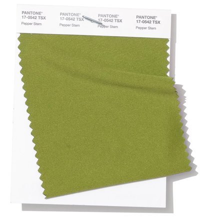
PANTONE 17-0542
Pepper Stem
Zesty yellow-green Pepper Stem encourages our desire for nature’s healthy bounty.
Virgil ablow used variations of this hue, as well as other styles including the Princess Blue, the rainbow colored runway he used when the Louis Vuitton menswear collection debuted.
Virgil ablow used variations of this hue, as well as other styles including the Princess Blue, the rainbow colored runway he used when the Louis Vuitton menswear collection debuted.
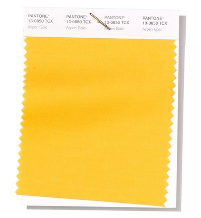
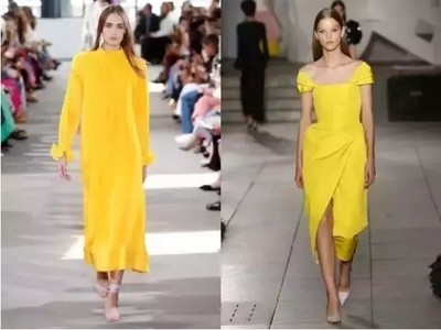
PANTONE 13-0850
Aspen Gold
Brightening our day, sunny Aspen Gold stimulates feelings of joy and good cheer.
High profile women like Amal Clooney, Kate Middleton, Meghan Markle and Kim Kardashian have made the color the focus of public attention. Millennials have pink and generation Z yellow.
With yellow still steadily climbing, poplar gold is a happy color. As its name implies, it is the golden age of the spring collection. So don't throw the baby out with the bath water because the bath water was heavy last quarter. Let's keep using it. And then the consumer will say, ok, I already have that yellow one. Maybe now I want to see the new colors of spring.
左:TibiSpring2018,右:CarolinaHerreraSpring2018
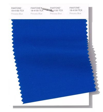
PANTONE 19-4150
Princess Blue
Princess Blue, a majestic royal blue hue, glistens and gleams.
According to eBay's annual UK retail report, Kate Middleton, the duchess of Cambridge, is reportedly more influential in fashion than Markle. But there is an indirect connection between this royal blue and the 'suits' - actresses turned into royalty.
Eisman said:
'always the winner, there's nothing you can do with that royal blue tone that people don't like. As we look at the world around us, Megan gets a lot of attention, just like the royals have for the past few years. Everyone will see what she's wearing. She's not a princess, but definitely a royal color. The most prominent cold tone.’
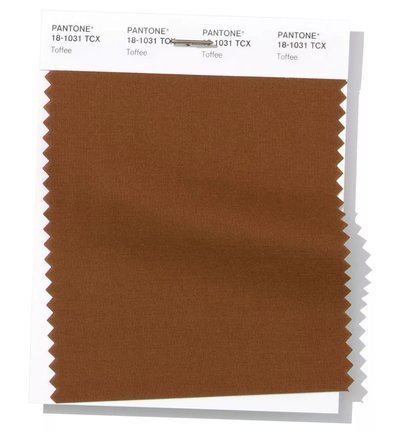
PANTONE 18-1031
Toffee
Deliciously irresistible, tasteful Toffee whets the appetite.
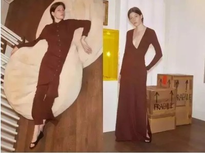
Think of chocolate, and then coffee and toffee become the natural progression of the color wheel. Brown may not be a sign of saffron season, but this season's hue is a lot richer than that of Maison Chocolat and Royce chocolate shops, not earth. Last month, Saint Laurent chief executive Clement Giraudet married Robin Wright in the same color vest, white shirt and black pants.
RosettaGettySpring2018
PANTONE 15-0960
Mango Mojito
The golden yellow Mango Mojito feeds our craving for pleasant comforts.
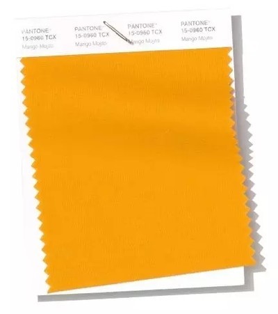
Eisman said:
It's another variant of the yellow family, and a homage to autumn's more golden hue. 'it's a comfortable color, with a warmth but also a depth.'
On the 'on the RunII' tour with JayZ, Beyonce introduced the hue to the masses by wearing Valentino couture gowns onstage.
PANTONE 18-0416
Terrarium Moss
Terrarium Moss
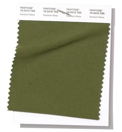
Eisman said:
Paprika powder is a deeper variant of paprika powder, while Terrarium Moss is a traditional or basic one that can be worn after one season to the next. From the collections of brands like Fendi, Reiss and Top man, menswear designers were among the first to join the trend last fall.
From eisman's point of view, this dark green works with unexpected combinations, with yellow being a natural combination.
PANTONE 14-2808
Sweet Lilac
An endearing pink infused lavender, Sweet Lilac’s easy and gentle manner quietly charms.
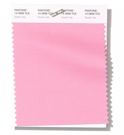
Pink's power will endure again in the spring collection. In recent years, this soft hue has emerged in a variety of ways. At the Venice film festival, Lady Gaga appeared in a delicate soft pink Valentino gown. Over the weekend, Chiara Ferragni, a blonde salad, got married with the help of a bridesmaid in a pink dress. The color is also a definite accent in Aretha Franklin's funeral procession, thanks to more than 100 pink Cadillac sedans.
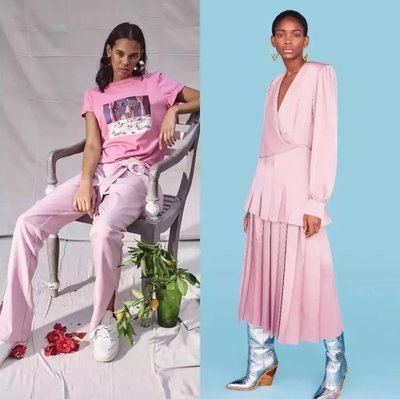
左:MaggieMarilynPre-Summer2019,右:FendiPre-Summer2019
4 big neutral colors for spring/summer 2019
To ensure that the previously mentioned bold colors have a solid foundation, there are four extendable neutral colors. As non-seasonal fabrics become more suitable for different climate regions, transition neutral fabrics are becoming more appropriate.
PANTONE 13-0919
PANTONE 13-0919
Subtle Soybean naturally appeals as a reliable and versatile neutral.
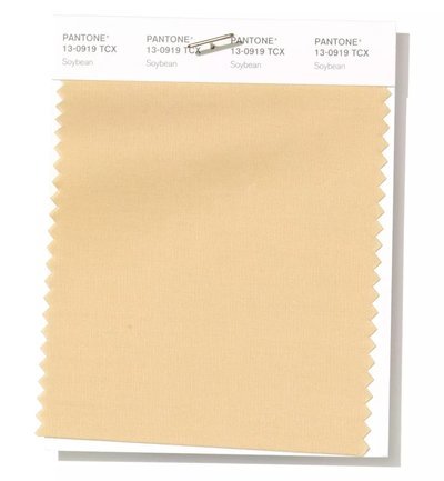
Eisman said:
'soy is a darker variant of sweet corn, and both colors convey a warm feeling, like wrapping yourself in a blanket, which is more of a psychological effect than a physical one,'
Soybeans are the foundation of the U.S. 's escalating trade war with China since tariffs were imposed on U.S. soybeans. Pantone's take on soy means that the person wearing it 'will only feel good or protected,' says Eiseman
PANTONE 19-3810
Eclipse
A deep blue redolent of the midnight sky, thoughtful Eclipse is both serious and mysterious.
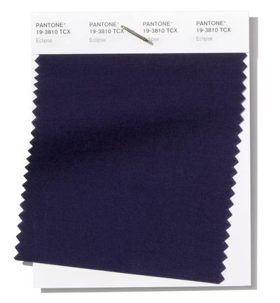
For astronomers and dreamers, the night sky never gets old. Like toffee and crystal moss, this very deep navy blue is more associated with winter.
Eisman said:
'in the spring, it's hard to escape any navy, it's very classic, it's a very deep navy. Though they're typical, we're seeing more navy in the fall and winter.'
PANTONE 11-0106
Sweet Corn
Sweet Corn tempts with its soft and buttery attitude.
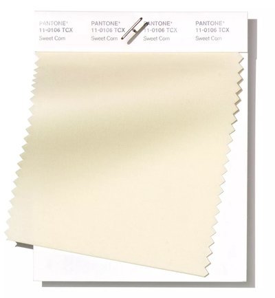
After labor day, the days of saying goodbye to whites seem to be fading.Lee edelkut, a forecasting expert at the trend alliance, predicted that the white variant would become a staple year-round in response to climate change. Sweet corn will do. At the Venice film festival,' favorite actress 'Emma stone appeared in the shade in a Louis Vuitton embroidered gown.
PANTONE 19-0805
Brown Granite
Brown Granite
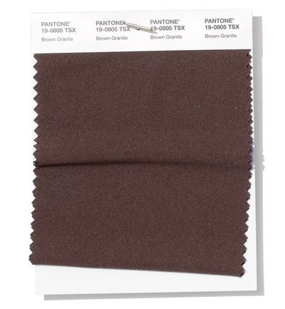
She says'a very good grounding color that provides a bit of versatility, a very strong, real color. This one goes well with mauve.' when referring to spring's list, Eiseman said,' the biggest surprise was browns use. Sometimes navy and black are the standard default base colors. Brown granite, the name implies strong, supportive brown.
